When it comes to stock (and option) picking, a sector comparative analysis can give you very valuable insights into potential investment opportunities. This article introduces our Reverse DCF (Discounted Cash Flow) Watchlist Excel template and how it can be applied to a specific industry. In only a few minutes, you can get a clear view of market valuation and identify potential buy/sell opportunities, just like a professional financial analyst.
Key takeaways
- The reverse DCF model lets you assess the growth rate expectations of a company based on its stock price.
- Running the reverse DCF model on a group of stocks can help you understand the market’s overall perception and expectations.
- Comparing companies belonging to the same sector can help you gain insight into stocks inside the industry. For instance, this can be an approach to finding the cheapest company in a sector.
How the Reverse DCF Model Can Help You Understand the Market
We have already had the chance to explain how the Reverse DCF Excel template model works in our previous article on the topic (and, if you want to learn more, you can check out our reverse DCF template with option strategies to learn how to trade options with this model). As a reminder, the Reverse DCF model is a valuation method that helps investors understand the implied growth rate of a company’s future free cash flow (FCF) based on its current stock price. This can give valuable insights into how the market perceives the company and its growth potential.
The main idea is that, if you believe the implied growth rate is too low compared to your own expectations, the stock might be undervalued and a good investment opportunity. On the other hand, if the implied growth rate is higher than you expected, it could indicate an overvalued stock.
Using our Reverse DCF Watchlist Excel Template, you can run the reverse DCF model on a group of stocks to gain a better understanding of the market’s overall perception and expectations.
This can be particularly useful when comparing companies within the same sector, as it allows you to identify potential opportunities or discrepancies between stocks (e.g., locating cheap stocks in a sector with high growth potential).
Using the Reverse DCF Model on Energy Stocks
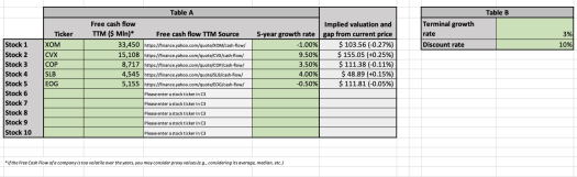
The best way to understand how this template works is through an example. Let us assume you want to run an analysis on energy stocks such as Exxon Mobil Corporation (XOM), Chevron Corporation (CVX), ConocoPhillips (COP), Schlumberger Limited (SLB), and EOG Resources, Inc. (EOG). We begin by focusing on the “Data” tab. Here, you’ll need to adjust the green values as described below:
- Firstly, insert the tickers of the stocks you’re examining into the “Ticker” column.
- Then, input the Free Cash Flow Trailing Twelve Months (TTM) in millions of US dollars. You can locate this information by clicking on the links in the “Free Cash Flow TTM Source” column.
- Next, adjust the 5-year growth rate, which represents the percentage at which the company’s free cash flow grows. You should tweak this value until the implied valuation column on the right displays a number that closely matches the current stock price.
- You’ll also need to set your Terminal growth rate, which is the percentage rate at which the company’s FCF will grow after the 5th year in the model. A good benchmark for this is generally around 3%, as analysts typically estimate it to be between 2% and 4%.
- Lastly, set your Discount rate, a value used to discount all the FCF future values. For the US market, this is typically between 8% and 12%, so 10% is a reasonable starting point for your analysis.
At this point, here is what you should be able to see:
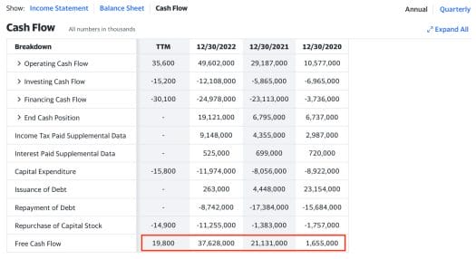
While we usually input the Free Cash Flow (TTM) value into the model, there are cases where this number may not accurately represent a company’s standard operations.
For example, companies with highly volatile free cash flow over the years may not have a representative “Free Cash Flow (TTM)” value. In such cases, an alternative approach could be to take the average number for the last 4 years (this is just a simple solution you may adopt and not necessarily the best one you can find). The main idea is to find an FCF number you feel is representable for the company’s performance to serve as the foundation for the analysis.
Consider CVX as an example, with an FCF TTM of only $19.8 million, significantly lower than its usual billion-dollar range. In this case, we take the TTM value and sum it to the 3 previous years, dividing by 4. This simple arithmetical approach results in a more realistic (but still not perfect) FCF average that you can use for your analysis.
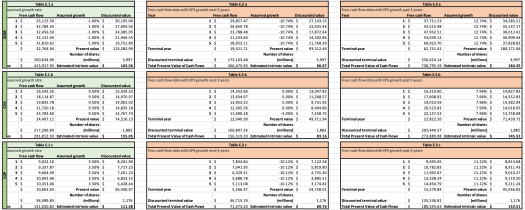
Don’t forget about the “Free Cash Flow Data” tab, providing information about the calculations happening “behind the scenes.” Here, you’ll find three tables for each stock in the analysis: one for the proper computation of the implied growth rate of a stock and two others simulating the same analysis using past and future EPS growth rates.
The results of these simulations will be reflected in the “Compare” tab, and we’ll tell you more about this in the section below.
What Can We Learn from the Reverse DCF Analysis?
So, what can we learn from the Reverse DCF model applied to these stocks belonging to the energy sector? Let’s take a look at the “Compare” tab.
This tab displays one table showing key information like stock price, market cap, number of outstanding shares, and the implied growth rate, all highlighted in yellow.
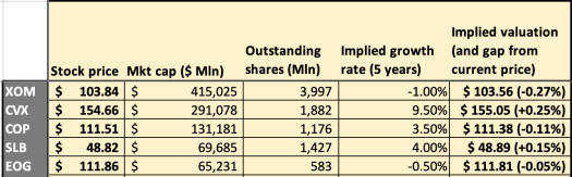
As you can see above, XOM and EOG are proving to be the “cheapest buys” (i.e., the stocks with the lowest implied growth rate), while CVX is clearly on the other hand of the group. Considering this, you may wonder whether these values make sense, and we’ll provide you with a few hints to study the matter.
In fact, if you move to the right, the gray section provides a snapshot of expected profitability for the next 5 years. It shows the implied stock valuation based on the EPS growth forecast as your FCF growth rate. However, remember that EPS growth and FCF growth don’t have a perfect correlation due to factors like increased investment, the economy of scale, stock compensation, etc.
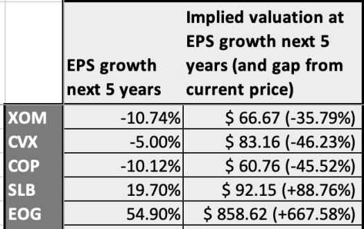
Consider how the expected EPS differs from the implied growth rate we found earlier. Now, XOM and COP have a strongly negative expected EPS growth rate for the next 5 years. On the other hand, we notice that EOG has an impressive expected EPS growth rate (54.9%). Again, do not mix this rate with the implied growth of a company’s FCF, but ask yourself: am I looking at an undervalued company?
Before getting to the conclusion of our quick analysis, let us move to the blue section mirrors the gray one but uses the yearly EPS growth rate of the past 5 years.
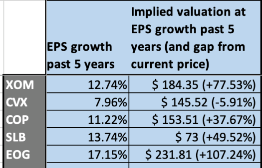
Once again, the past EPS growth rate shows that EOG tends to overperform compared to its competitors. This is yet another hint that you may be looking at an undervalued company.
The pink column on the right reveals analysts’ target price and its percentage difference from the current stock price.
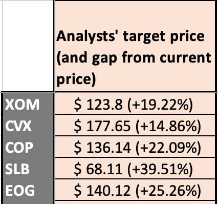
After observing the analysts’ target price, you have all you need to make a decision on these five stocks. Note that EOG price is expected to move upward by 25% in the future. All the other stocks have appealing target prices, but EOG is the one that caught our attention throughout our whole analysis, as explained above.
So, what did we learn? With this comparison, you gain insights into the “cheapest” or most expensive companies and which ones the market deems high-quality. For instance, the fact that XOM and EOG have a slightly negative implied growth rate should make you think: are there company-based facts that are pushing the market to believe that their FCF will contract in the future? Or is the market simply wrongly evaluating these stocks?
Alternatively, take a look at CVX, which has a much higher implied growth rate than the other companies. If the market is too optimistic about its growth potential, investing in CVX may not be a wise decision (you may even decide to short the stock). You can always refer to our stock valuation spreadsheet to build a deeper analysis of any company.
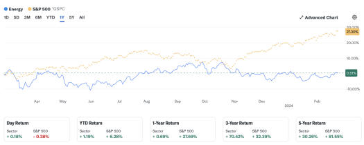
Also, remember that the relatively low implied growth rates for energy stocks align with the fact that these stocks are typically less volatile compared to the market average, as you can see below in a comparison between the Energy stock performance at Wall Street and that of the S&P 500 index.
With this tool, you can quickly identify potential investment opportunities in the energy sector and make informed decisions based on market perception and expectations. It won’t likely take you more than 5 minutes to populate the data for these companies and compare them, but the insights you gain can be incredibly valuable.
Also, it goes without saying that you should replicate this analysis over time as market conditions and company fundamentals change.
Download the Template:
DOWNLOAD THE EXCEL REVERSE DCF WATCHLIST TEMPLATE HERE
ACCESS THE GOOGLE SHEETS REVERSE DCF WATCHLIST TEMPLATE HERE
Read more about how to import Options data to Excel and Google Sheets