Traders that trade with the trend, increases their chances to be profitable in the long run. While it is impossible to completely predict the market, we can judge different patterns and sentiments in the market in order to help us improve our odds for profits.
A common terminology for the market is ‘Risk On’ when there is a greater risk appetite in the market and ‘Risk Off’ when there is greater fear. The terms are based on the perspective investors have on the current conditions in the market: If they believe the market is wrongly priced, the bid for riskier assets, and those will go up. This is “risk on”. On the contrary, when investors sell riskier assets and buy safer ones it “risk off” mode. This usually happens due to real world changes: trade war, natural disasters, geopolitical etc.
In this article we will describe one indicator that helps us understand if we are in a risk on/off environment and allow us to invest with the trend.
The Relative Strength model:
Relative strength, like the name suggests, measures the return of one asset against another asset. This way we can “eliminate noise” and try to isolate the variable we are looking for. In his book – Technical Analysis: Power Tools for Active Investors – Gerald Appel suggest to look at small stocks (riskier stocks) performance v. larger cap stocks (less risky). We do it in order to gauge the market “appetite” to risk. If riskier stocks outperform less-risky stocks – the market is predicted to move higher as there is an appetite for risk, and vice versa – It is a bearish signal if less risky stocks are out-performing. Notice that comparing 2 assets allows us to “cancel” the trend in order to “focus” on risk appetite (for example we can ‘cancel out’ events like trade wars as they are expected to effect the entire market. So by gauging the relative performance we still see the risk appetite).
There are many ways to measure this: We can test the S&P500 vs Russell 2000, we can check sectors, We can build custom universes and time frames etc.
In this article we use SPX (S&P 500) to measure the “safe” stocks and the Nasdaq (IXIC) to measure the riskier stocks. We calculate a ratio by dividing the Nasdaq / SP500 and create a 10-week average. If the current ratio is above the average – it’s a bullish sign, and under is a bearish sign.
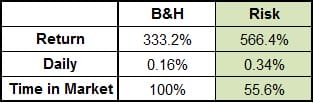
The following chart describes the p/l of the Risk model v. Buy&Hold, from Jan 1994 till Dec 2014:
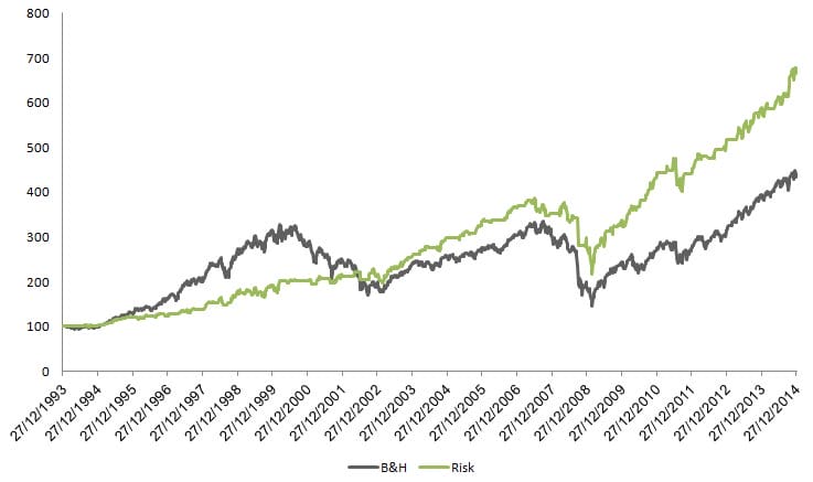
We can see over the last 21 years the model out-performed B&H with less time in the market + less volatility and draw down. However we can see a really long period (up to 2000) where the model under performed.
In conclusion: This model is just an example. You can build your own, even very simple with Google sheets. This article was just an example to help you understand how you can better assess the market sentiment and gain an edge trading in market.